As we all know, Thatcher privatised our housing stock and pocketed the funds. She made billions from Right to Buy and we provided billions in subsidy to the already well-to-do, but she didn’t bother to build any more houses so we got screwed. That’s where our housing problem comes from. A picture tells a thousand words and a big white space probably tells even more:

But not so fast! It might look like a lot of housing is getting built after the war, but that’s misleading. As not so many of us know, we didn’t just build lots of housing, we cleared slums on a vast scale. 15% of the UK’s population was affected and the overall building rate looks a lot less impressive. The blue line (via Neal Hudson) shows the net effect.
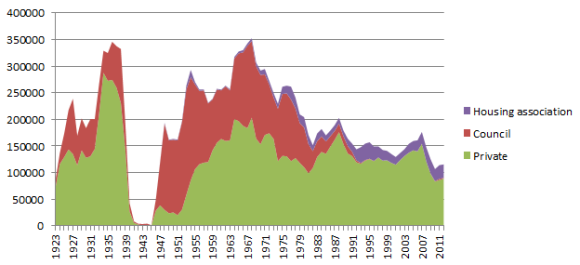
 The post-war years still look good, but at a lot less stellar. Thatcherism doesn’t come out of this well, but New Labour? They look good. Which was news to me, as I’m sure it’s news to you. the housing stock expanding at its fastest rate for decades during the mid-2000s…despite us…not really building many houses. “Hang on, how does that work?” you’ll be asking. “Don’t worry.” I say, “this is 2014 and all explanations now come in chart format!”

What this graph shows, again from Neal Hudson, is that houses were being built, but they were also being subdivided and other stock was being brought into use. Houses were cut in half (or more) and commercial properties were converted. The high prices that tight housing supply created actually caused the number of terraced houses in London to decrease from 2001-2011, such was the rate of flat conversions. So New Labour did have a solution and it was high prices. But it would be remiss to blame New Labour, when you can blame Old Labour. There’s bipartisan support for that.
Not so fast! As a different all of us know, it was the Town and Country Planning Act of 1947 that caused the housing shortage. The 1930s saw a phenomenal rate of private home building, far in excess of anything achieved before or since, only brought to a standstill by Hitler and rearmament. Private builders can build lots of housing and the Planning Act is one reason they didn’t when the state stopped building. But there’s no wishing away the Planning Act for a magical return to the 1930s.
“Build more houses” is a good rally cry, but how? NIMBYs have rights. These rights are property rights. When they bought their houses they also bought the right to block other building nearby. This wasn’t a mistake, this is what they were told and what people consider normal. That’s a right in anyone’s book. If we want to build more housing we will have to expropriate them or buy them. And they ain’t selling cheap.
You know nothing about the housing crisis and that any easy solution you have is wrong (except maybe a simple plan). You should also realise there’s no libertarian solution to the housing crisis through deregulation. These rights are held inalienable. The same rights block a social democratic solution of more council housing. The only thing that remains is a Stalinist solution: the socialisation of property rights and the liquidation of NIMBYs as a class.
If you want to blame Attlee, Blair or Thatcher for the housing crisis you haven’t been paying attention. And you’re not nearly being ambitious enough with your cliches. The real villain behind the housing crisis, if there is one, is Hitler. And like Hitler the only solution will be Stalin.
UPDATE: Now with bonus chart!
@leftoutside also population growth had almost ground to a halt by early 1980s — MJT (@mjturner1975) January 3, 2014
A very good point, and one which partially vindicates the slowdown in homebuilding in the 1980s (although not its continual stagnation). The below chart shows the deceleration, stall and gradual increase in population growth from 1960-2010. 

Good stuff. As always these problems and solutions aren’t as simple as those with a political axe to grind would have us believe.
As a matter of interest do you know if the data in the first graph includes pre-fabs? These were always meant to be temporary so showing them being built and then destroyed would distort those figures somewhat.
I do not know that. I am only beginning to grasp the depth of my ignorance of the housing market. However, that is the first step to learning more so hopefully I can get back to you.
An important point in here is quality, and specifically space. It would be interesting to see a series in terms of rooms or square footage.
Absolutely agree. More research required as they say. To start with though, here’s a graph of dwelling size by average household size: https://pbs.twimg.com/media/BdDaCQkCQAAqOKe.png
Big increase in one person, small increase in two, declines everywhere else. I’m guessing divorcees, young professionals delaying children and everyone else respectively.
Reblogged this on SyesWorldView and commented:
A great article on the housing market in the UK
Interesting WRT density of population. Superficially you’d extrapolate an increase in density during the 2000’s, but if there’s a concomitant jump in the number of people living alone (plausible), then how do density rates in the current housing market atmosphere compare to either the libertarian antebellum fantasies or the socialist post-war settlement utopia?
I’m pro-density myself, so I think all this subdividing and re-purposing is the way to go, especially as the population continues to age & more pensioners are rattling around like peas in huge family homes. It also alleviates the NIMBY’s Rights problem, a bit. Thoughts?